
iOS · Android · 2026
2026 / Redesign · Brand · iOS · Android
RusGuard Key
A redesign of the app that turns a smartphone into an access pass: mark, logotype and icon, 15 screens for iOS and Android and a design system.
15 screens
and 3 notifications for iOS and Android
Brief
A pass that's always with you
In RusGuard Key the smartphone replaces the access card: doors, gates and barriers open without a plastic pass. The client needed a new design for the iOS and Android app. The logic and the set of screens stayed the same; we rebuilt the interface and refreshed the mark and the icon.
Three ways through
NFC
Hold the phone to the reader, like a contactless payment.
BLE
Shake the phone or unlock the screen near the reader.
QR code
Show the code from the app to the reader's scanner.
Developer requirements
No Liquid Glass
The effect causes problems on Android.
No gradient animations
They are complex and expensive to build.
Near-native switches and dialogs
iOS makes them hard to restyle, and custom dialogs cost more to build.
System fonts
SF Pro on iOS, Roboto on Android.
Brand
Mark, logotype and icon
The mark is built from three identical plates on three equal rows, with every edge at the same angle. The geometry stays legible in the logotype and in a small icon on the home screen.
- identical plates
- 3
- equal rows
- 3
- edge angle
- 59°
#9FC1FF → #627198
Keys
Three key types, three card materials
The key type shows at a glance: each has its own card — black, silver or gold. The type is picked in a single sheet, and each type's form stays short.
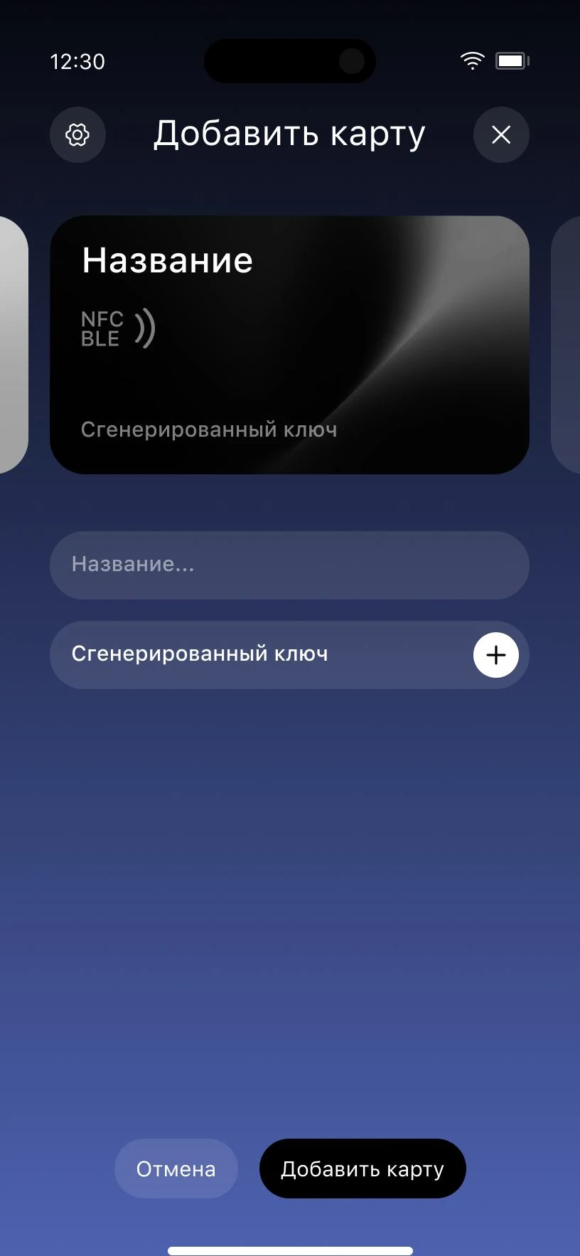
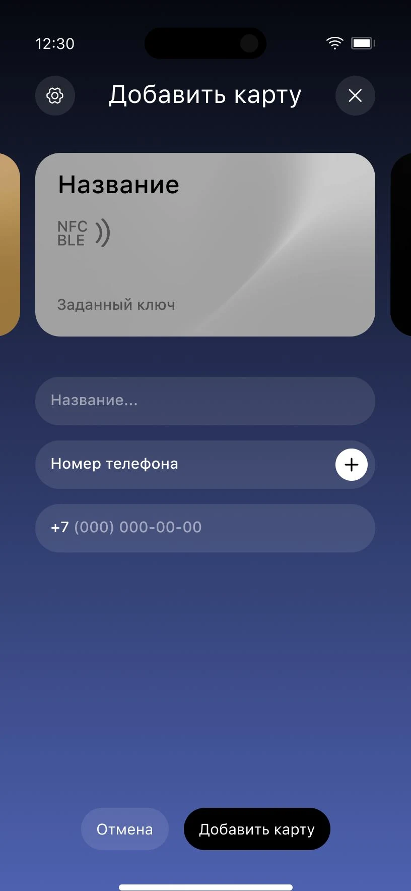
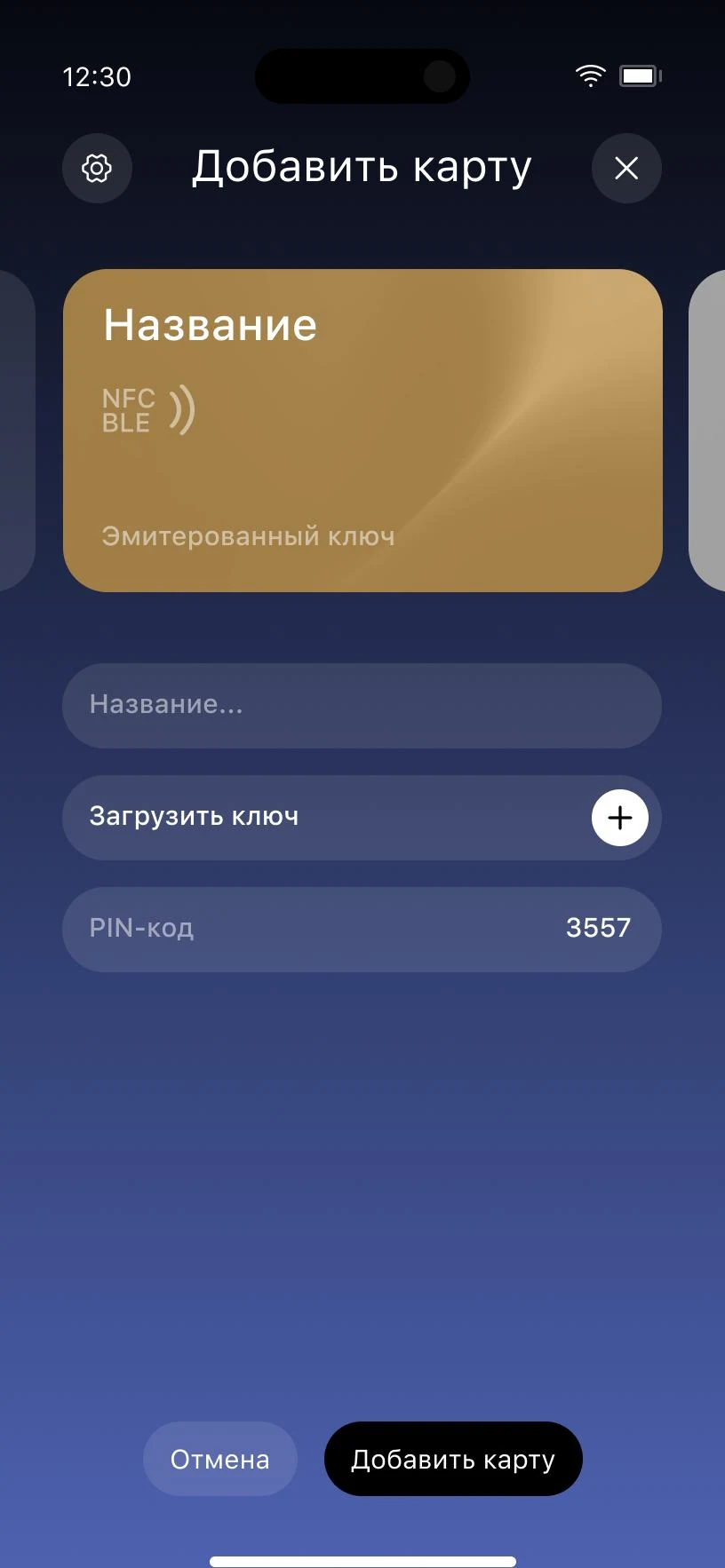
The key is created right in the app.
Screens
15 screens and 3 notifications
The file covers the states as well as the core screens: an empty home screen, an inactive key, a successful and a failed read, settings with and without changes. Where the platforms differ, iOS and Android get their own screens.
Home screen
01–04
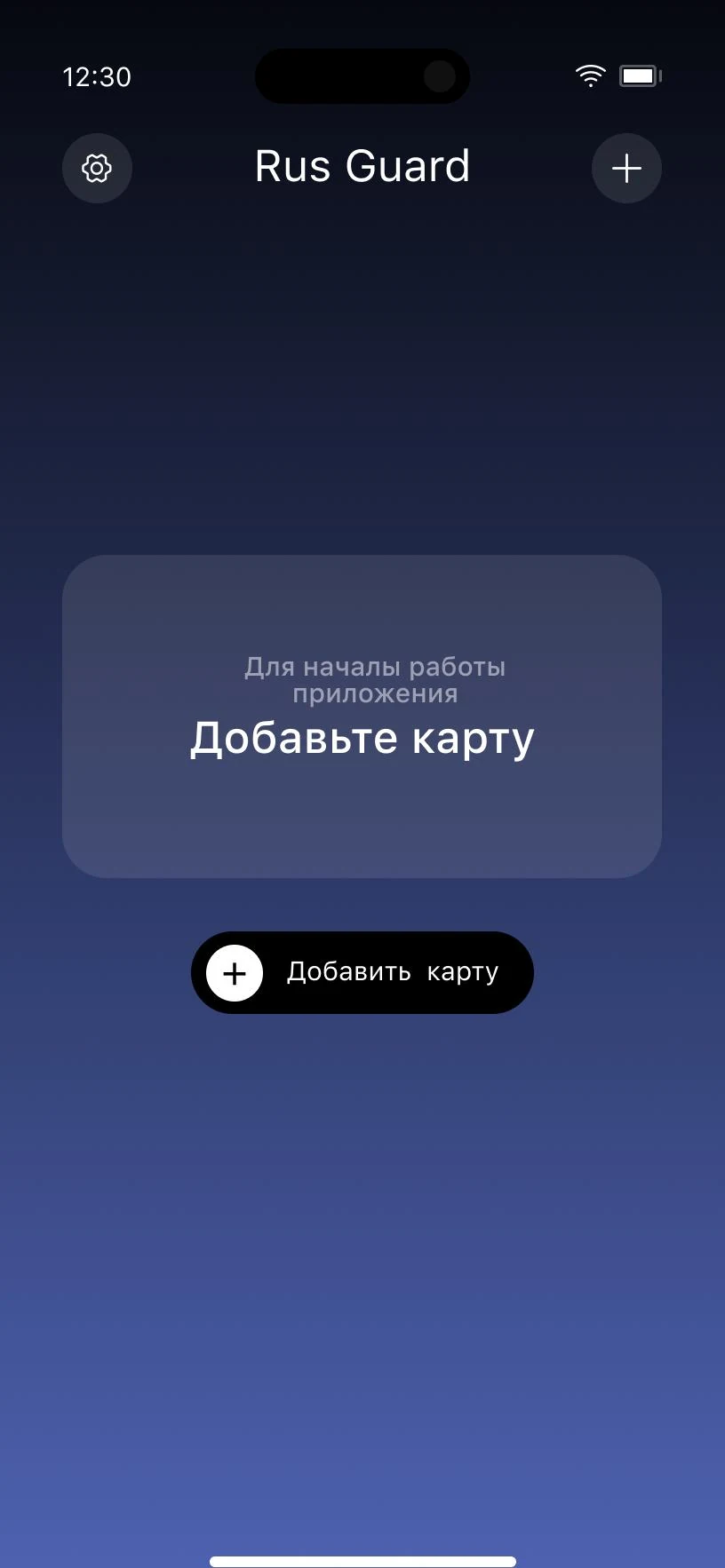
01 No cards
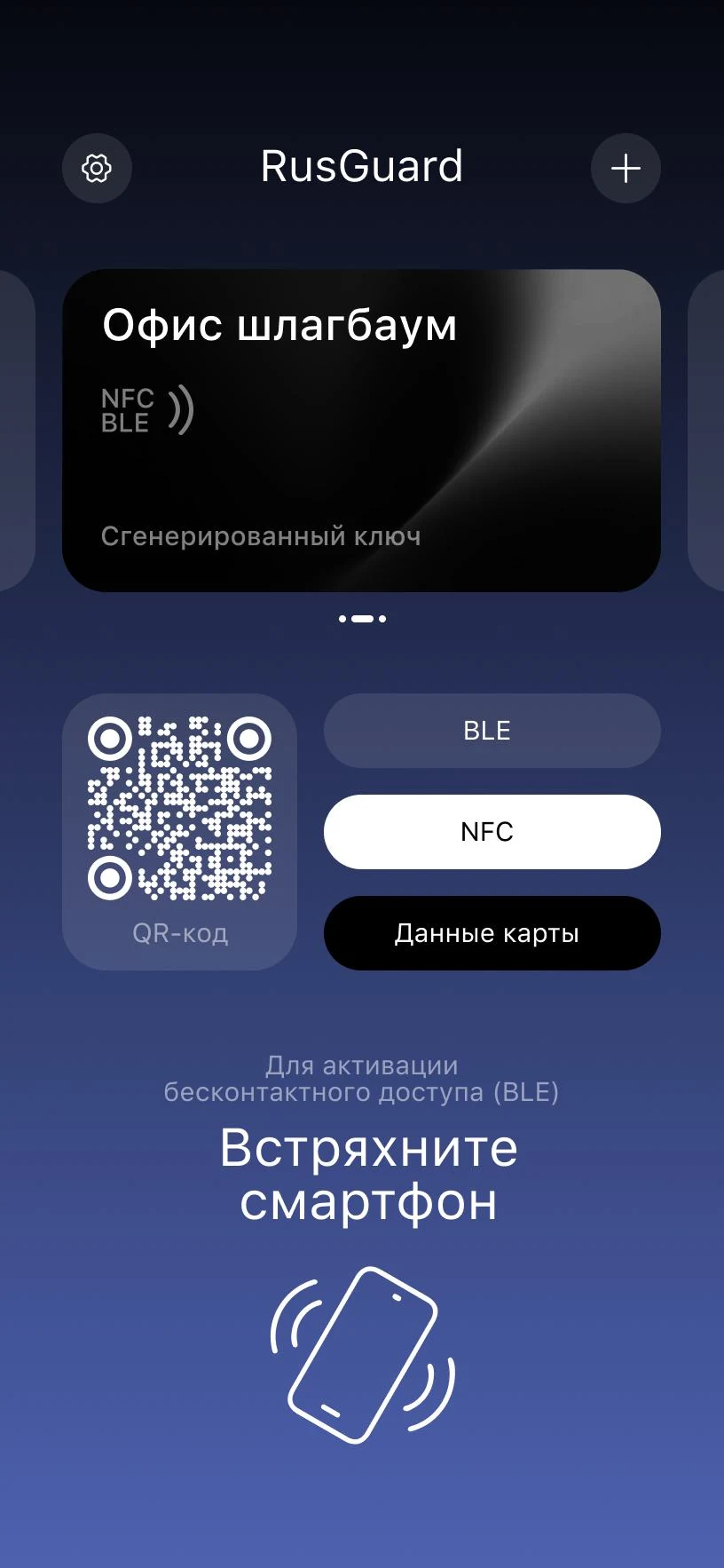
02 iOS
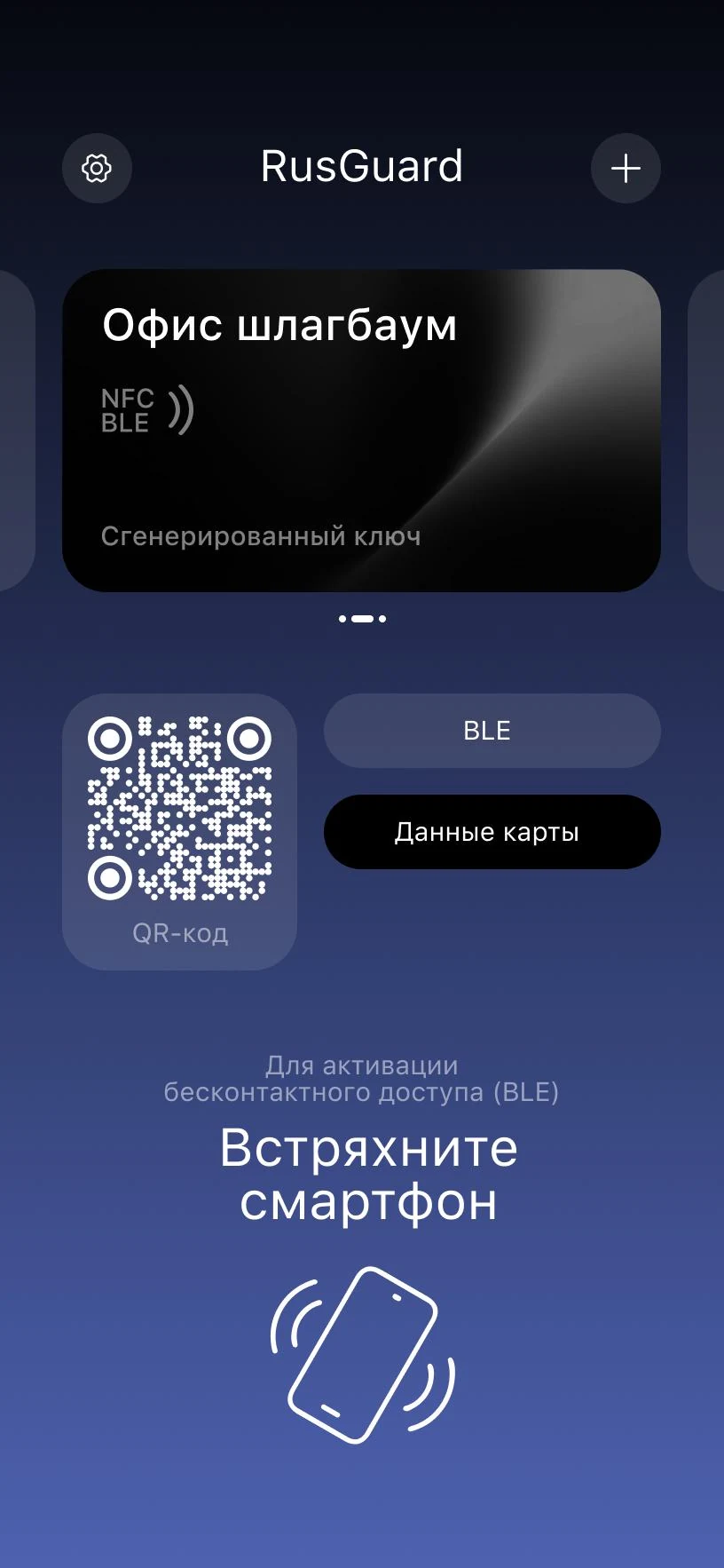
03 Android
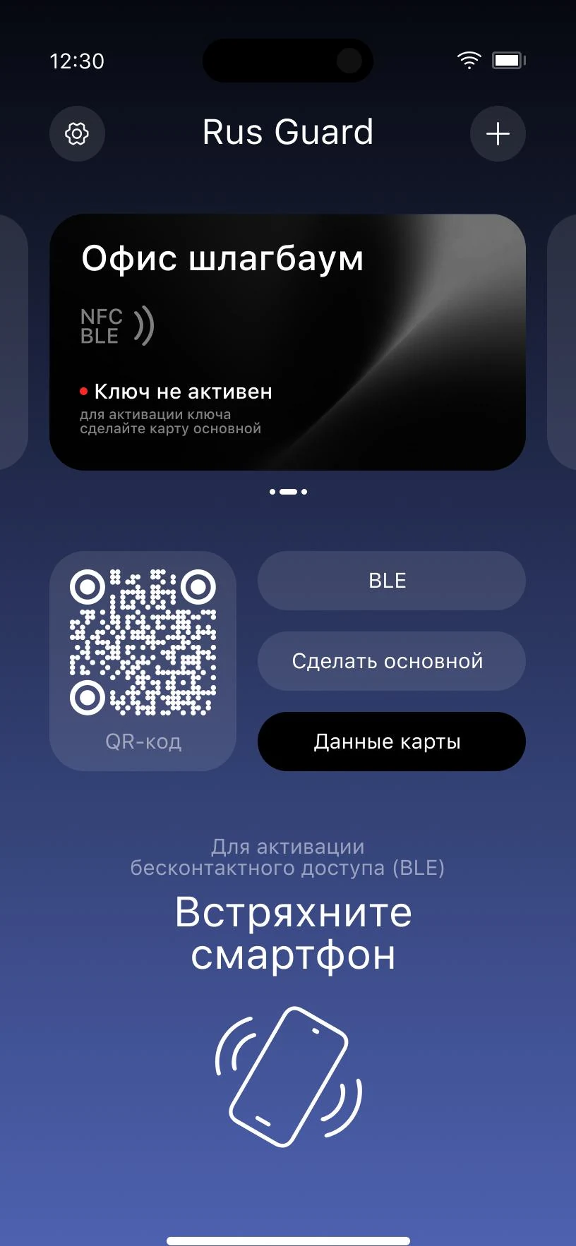
04 Key inactive
Card
05–06
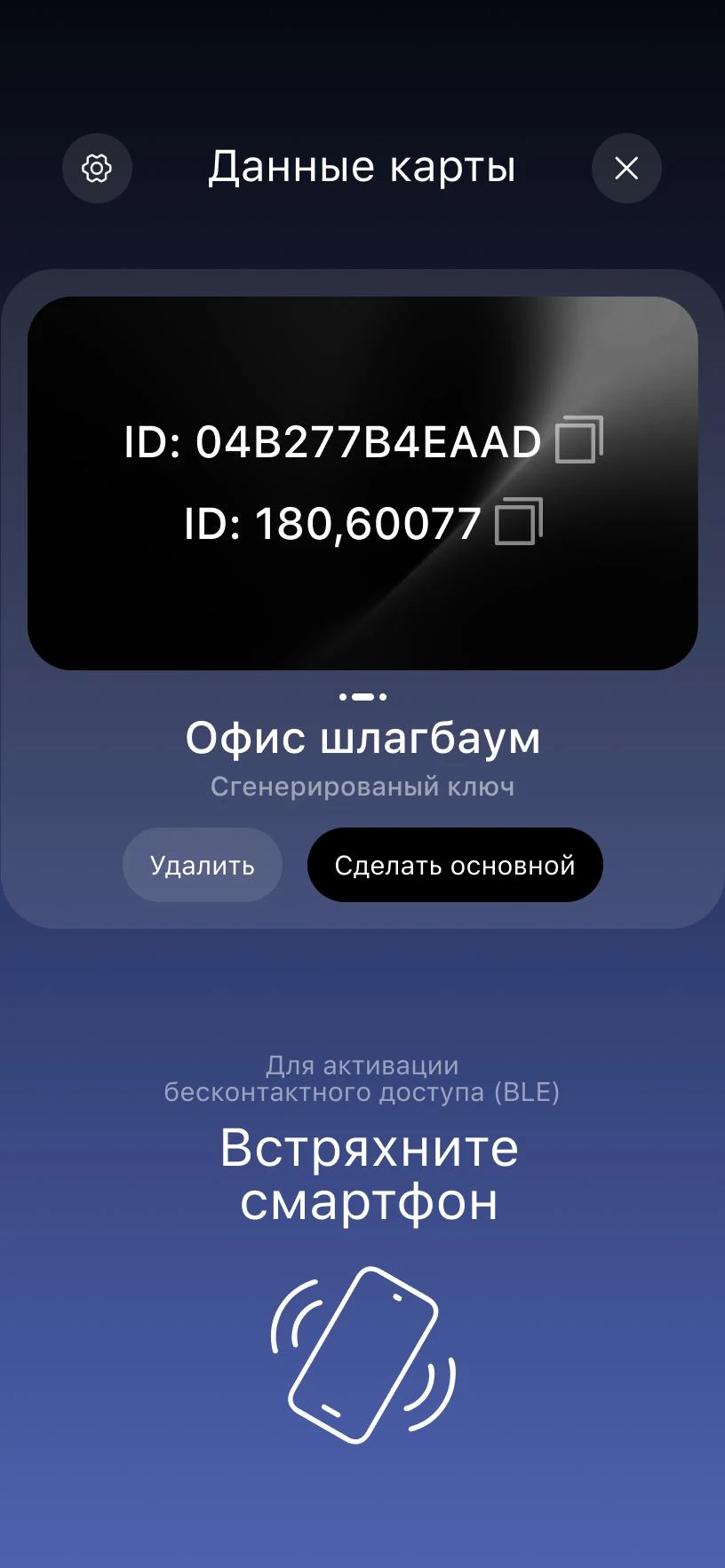
05 Card details
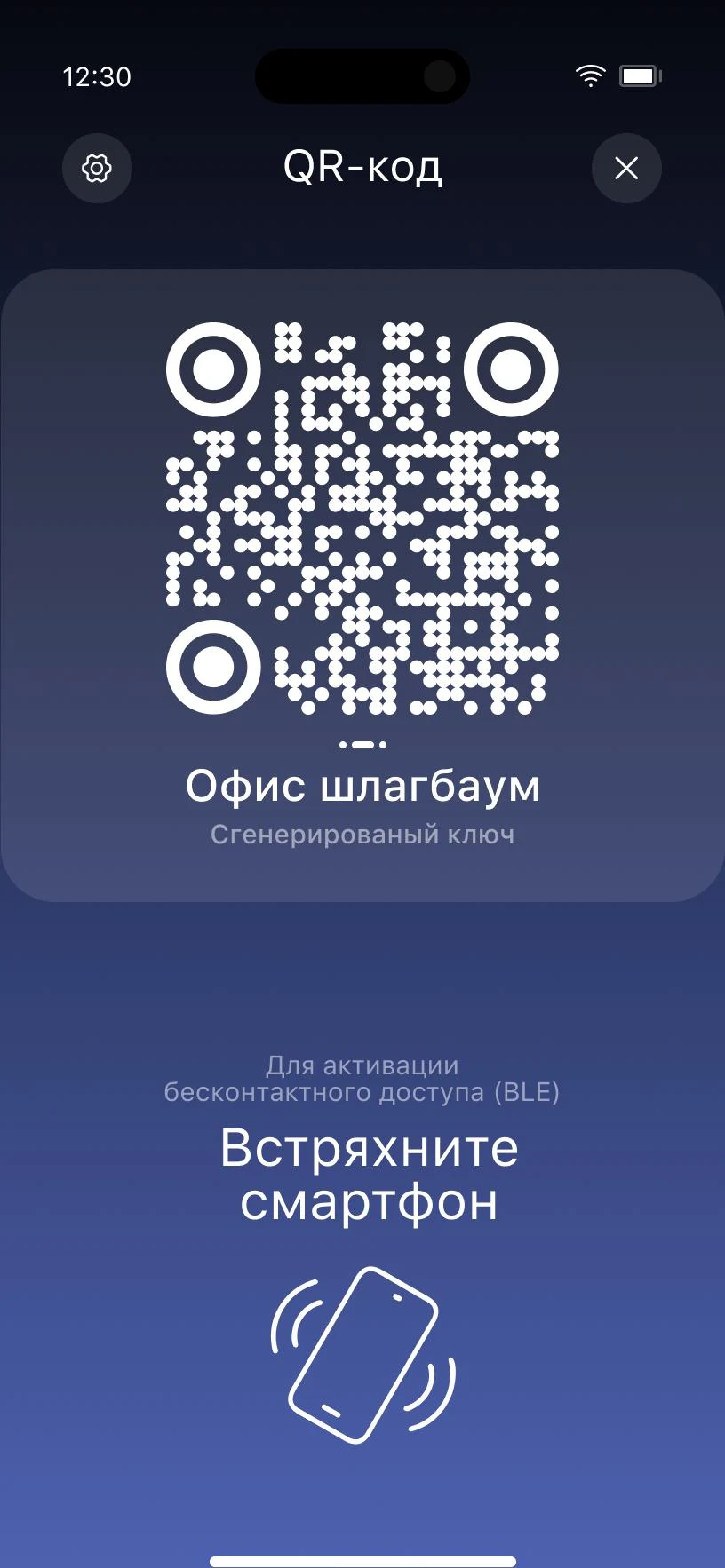
06 QR code
Reading
07–08
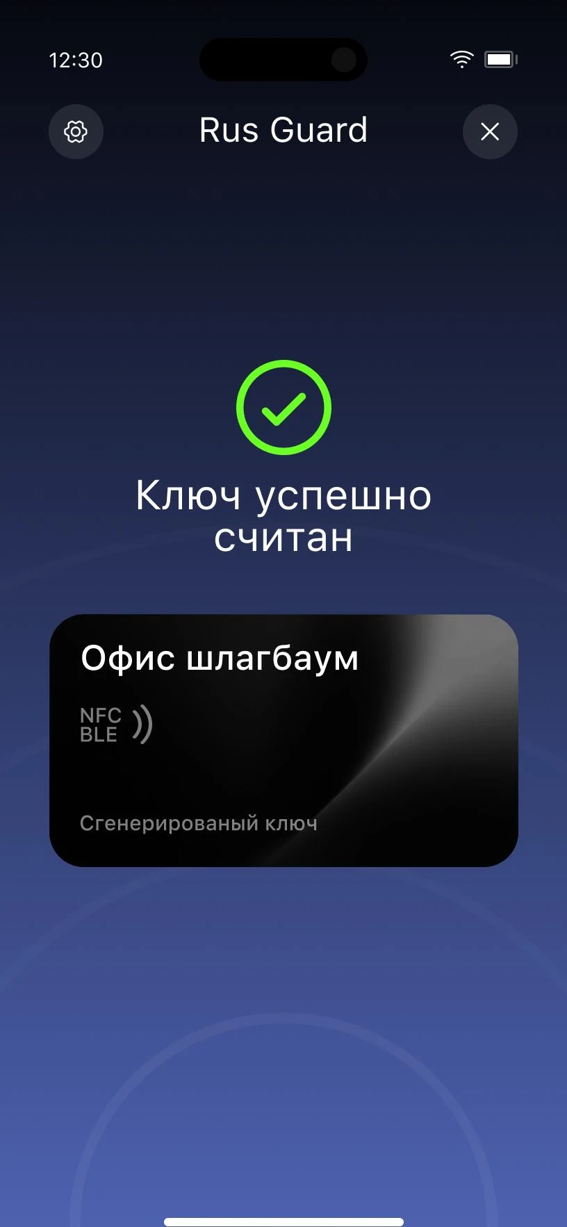
07 Key read
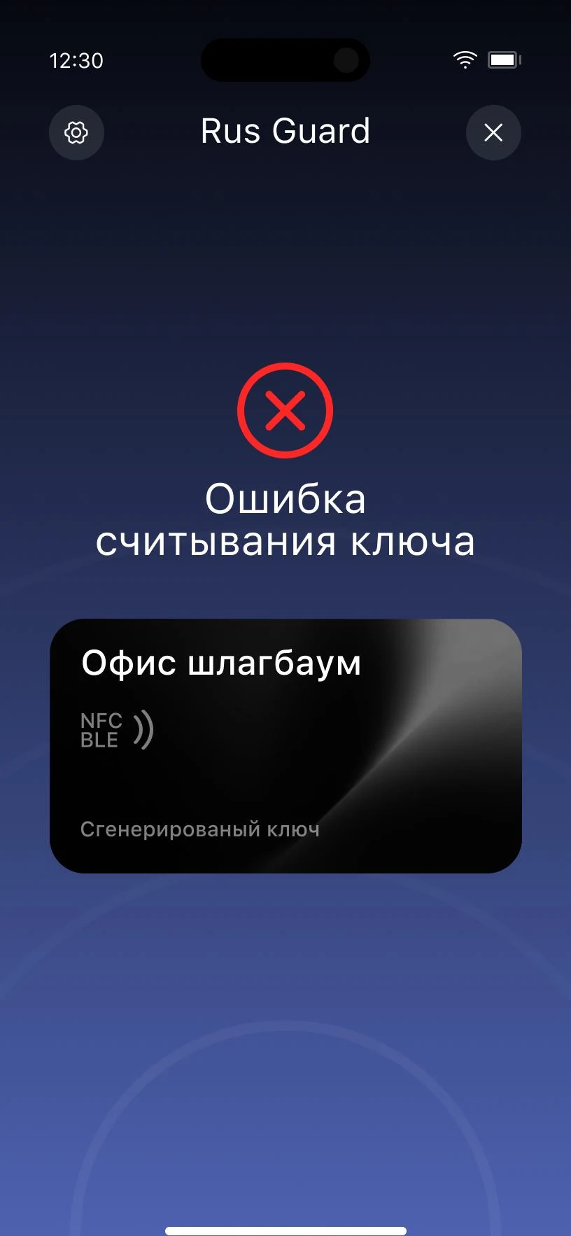
08 Read error
New key
09–13
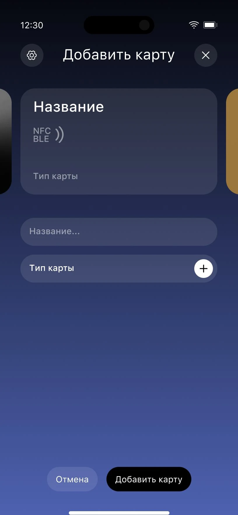
09 New card
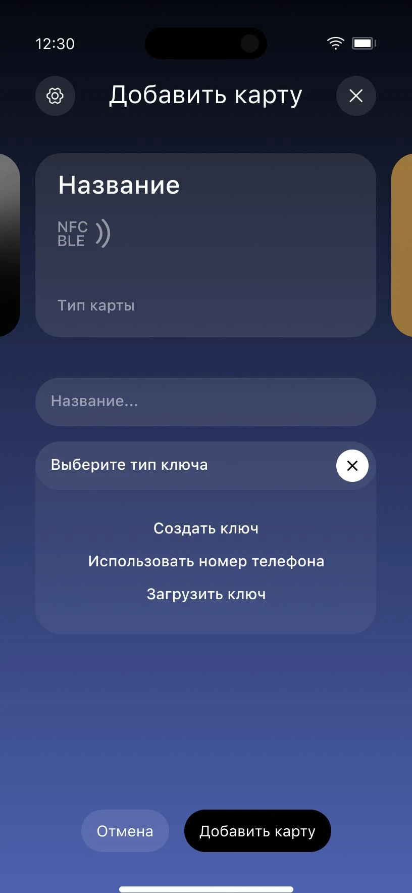
10 Key type
11 Generated
12 By phone number
13 Issued
Settings
14–15
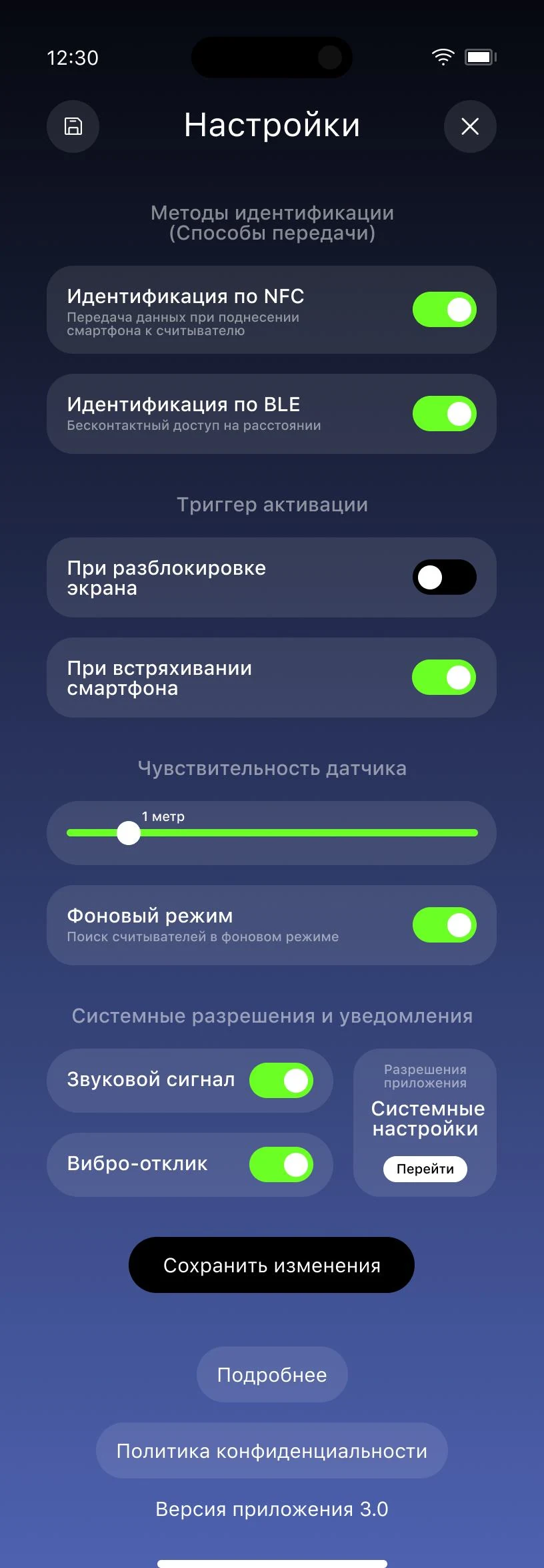
14 Unsaved changes
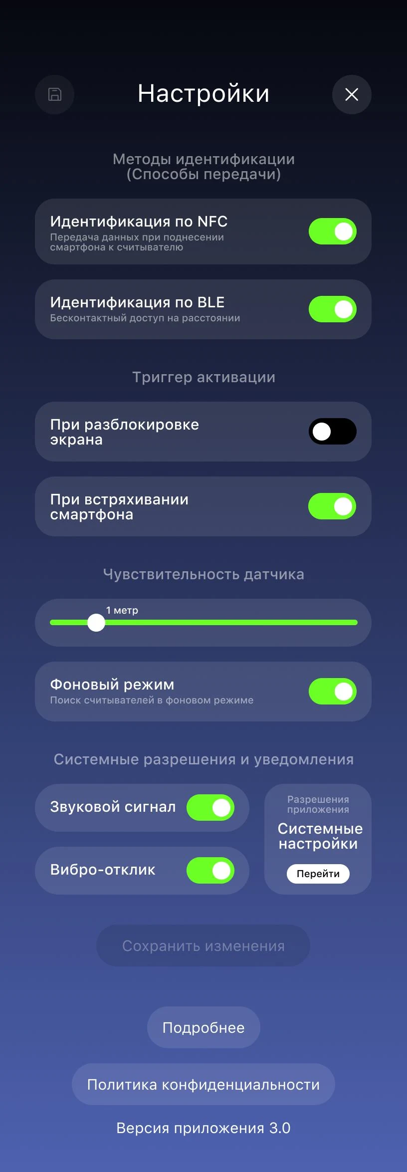
15 No changes
Notifications
16–18
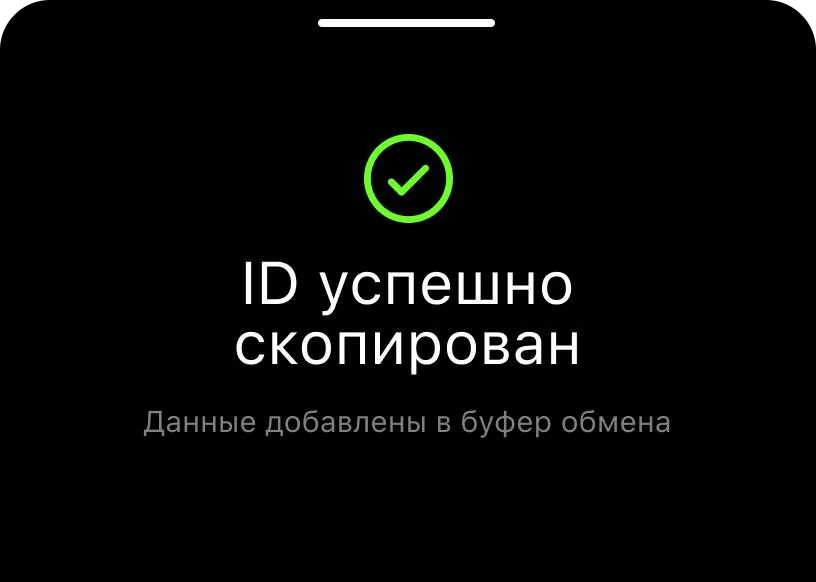
16 ID copied
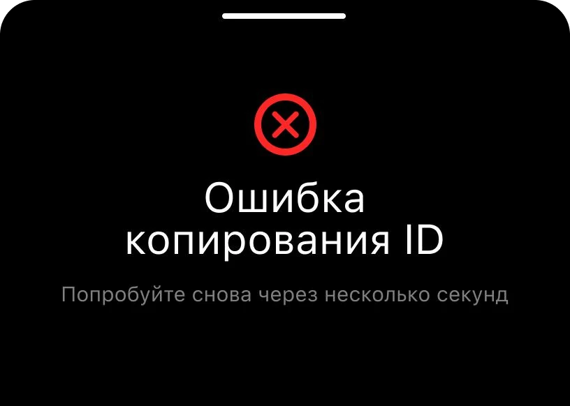
17 Copy failed
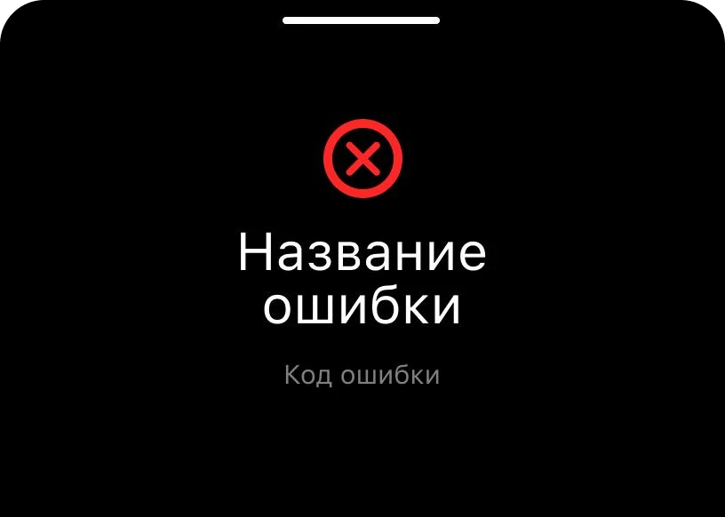
18 General error
Design system
The system behind the screens
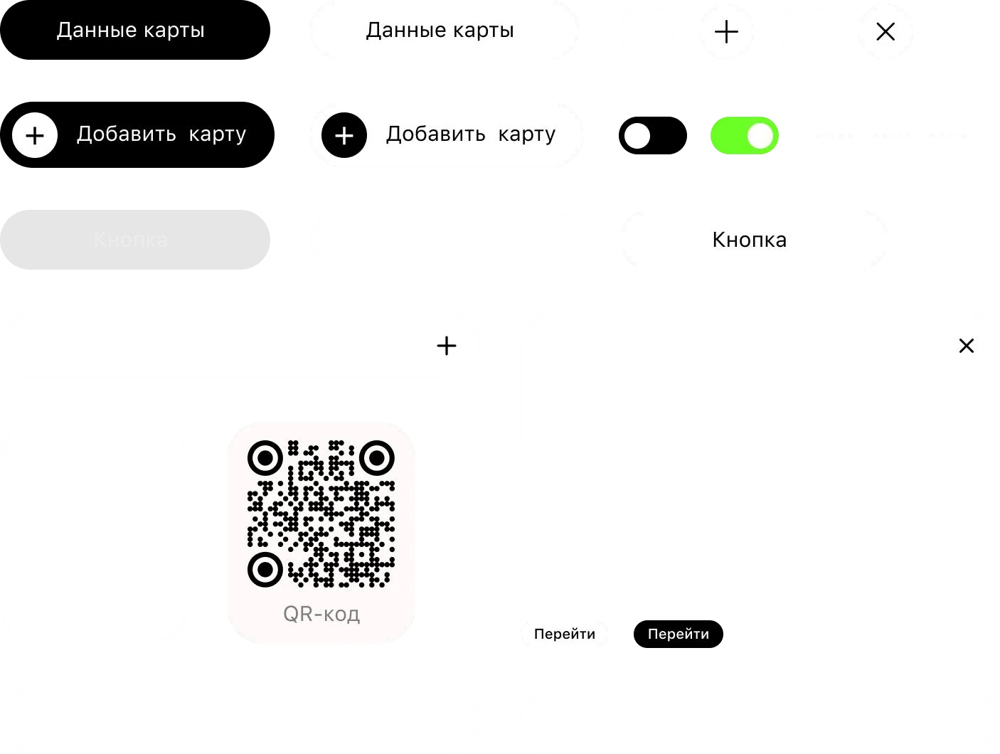
Alongside the screens the file carries the rules: every color has a job, every iOS typeface has an Android pair, spacing follows set steps, and components are shown in their states.
Palette
#FFFFFF
Text and buttons
#FFFFFF · 50%
Captions
#FFFFFF · 30%
Disabled button text
#FFFFFF · 10%
Button fill
#6A85F0
Bottom of the background
#000000
Top of the background, buttons and panels
#000000 · 50%
Text on the silver card
#000000 · 10%
Save button backing
#6BFF26
Success and a switched-on toggle
#FF2626
Error
Typefaces
iOS
SF Pro Text
Android
Roboto
On Android each SF Pro Text weight is replaced by its Roboto pair.
Spacing
- 30 px
Inside buttons and between related controls
- 22 px
Between a title and its caption
- 80 px
Between blocks on the main screens
- 60 px
Between blocks in settings — tighter, for less scrolling
- A refreshed mark, logotype and icon
- 15 screens and 3 notifications for iOS and Android
- Three card materials for the key types
- Components in their states
- Palette, typefaces and spacing for development